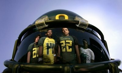

The Oregon football team uniforms just went through a severe makeover. Supposedly, these threads were designed by the players. We got a preview of this at last year's Civil War. I noticed that they changed the number that looked like they were made of yellow duct tape. The new font is called Bellotti Bold. I think it is one of the biggest things that makes these unis look so awkward. The one thing I really like is the diamond plating on the shoulders. I love them if they continue to play at or above the level they did last year.

2 comments:
Great site lots of usefull infomation here.
»
Your site is on top of my favourites - Great work I like it.
»
Post a Comment